|
|
Post by Jet Nut Sauce on Jul 1, 2015 11:18:24 GMT -5
I'm thinking dark gray with dark green if they do something drastic. Actually, I think unpainted/ matted helmets (gray) w/ dark green logo of a fighter jet would look rediculously cool. Not far from what you are calling for. Pretty much my thinking. Gray uniform with a darker matte gray helmet, the second logo, larger than the original, from the 70s in green. could even style the rest of the uniform to the 70s look just gray and really dark green |
|
|
|
Post by The Tax Returns Are in Kenya on Jul 1, 2015 14:08:16 GMT -5
Why don't they take the army-ish green we now have, add khaki or tan and then it will look like camouflage and then take the whole military thing a step further, and then add a fighter jet
|
|
|
|
Post by designerjet on Jul 1, 2015 18:16:07 GMT -5
I think the logo from the 80s makes the most sense. The uni's would obviously need to be designed differently. How can we have a logo for a team called the Jets with no suggestion of a Jet or movement, etc. I understand people not wanting to part with the logo we won a Super Bowl with, but that doesn't make it good. It has no concept except that it's a football team. Any team could be plugged in that football like the Bills, etc - as long as it's short. Go back to the conceptual ID and maybe we'll start to have an stronger brand and overall better direction. It all filters down from the top to make a winner and these issues are not insignificant. Have you ever heard of a successful company that sticks with an outdated brand?
|
|
jaysfiend23
Junior Member
 i like to repeat myself
10%
Posts: 53 
|
Post by jaysfiend23 on Jul 1, 2015 19:56:46 GMT -5
Wouldn't mind a black alternative nike would do it right
|
|
|
|
Post by JetRepulsion1 on Jul 2, 2015 13:21:45 GMT -5
I think the logo from the 80s makes the most sense. The uni's would obviously need to be designed differently. How can we have a logo for a team called the Jets with no suggestion of a Jet or movement, etc. I understand people not wanting to part with the logo we won a Super Bowl with, but that doesn't make it good. It has no concept except that it's a football team. Any team could be plugged in that football like the Bills, etc - as long as it's short. Go back to the conceptual ID and maybe we'll start to have an stronger brand and overall better direction. It all filters down from the top to make a winner and these issues are not insignificant. Have you ever heard of a successful company that sticks with an outdated brand? [ Rite on brother. R logo stinks but could be great with some movement, fighter jet action. Sick of our boring ass uniforms and crap tactic logo. Fighter jet. Woody r u listening??! !?? Don't make us get out the banners before training camp even starts!!! |
|
|
|
Post by HawkeyeJet on Jul 21, 2015 12:02:59 GMT -5
Posting this for 2 reasons. First and foremost, this SI cover is fucking awesome. 2 , the logo on the helmet in the Revis picture is White, not green. Is this just for the picture or a permanent change? 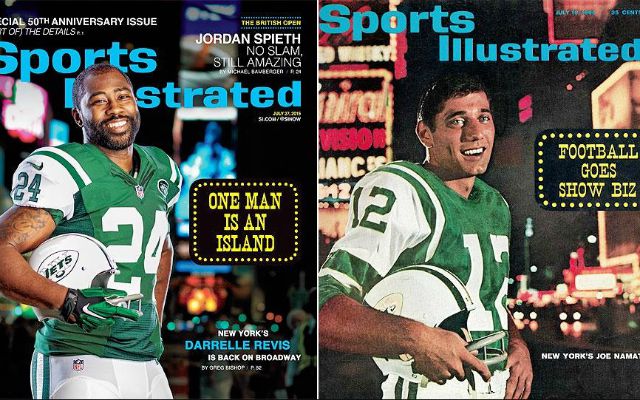 |
|
|
|
Post by Harrier on Jul 21, 2015 12:16:47 GMT -5
Posting this for 2 reasons. First and foremost, this SI cover is fucking awesome. 2 , the logo on the helmet in the Revis picture is White, not green. Is this just for the picture or a permanent change? Thread worthy, was just gonna start one when I came across your post. Great cover. |
|
|
|
Post by Peebag on Jul 21, 2015 12:17:56 GMT -5
Posting this for 2 reasons. First and foremost, this SI cover is fucking awesome. 2 , the logo on the helmet in the Revis picture is White, not green. Is this just for the picture or a permanent change? That was the helmet from the '64 season - similar to the one Namath is holding on the original SI cover. |
|
|
|
Post by Bing© in Buffalo Chairman on Jul 21, 2015 12:19:01 GMT -5
RETWATTING
|
|
|
|
Post by Harrier on Jul 21, 2015 12:21:34 GMT -5
New coach, new GM, new players, why the fuck not new classic uniforms? Full circle from T u r k e y neck
I despise that shade of green and patch on the current ones.
|
|
|
|
Post by Touchable on Jul 21, 2015 12:37:57 GMT -5
Posting this for 2 reasons. First and foremost, this SI cover is fucking awesome. 2 , the logo on the helmet in the Revis picture is White, not green. Is this just for the picture or a permanent change? I could actually get on board with this Switch back to the white cleats too |
|
Deleted
Deleted Member
Posts: 0
|
Post by Deleted on Jul 21, 2015 12:49:51 GMT -5
|
|
Deleted
Deleted Member
Posts: 0
|
Post by Deleted on Jul 21, 2015 13:12:44 GMT -5
mods please merge this with the "did anyone else binge watch 'say yes to the dress' season 4? omg" thread
|
|
|
|
Post by Lithfan on Jul 21, 2015 13:15:58 GMT -5
Posting this for 2 reasons. First and foremost, this SI cover is fucking awesome. 2 , the logo on the helmet in the Revis picture is White, not green. Is this just for the picture or a permanent change? Love the cover. Did you happen to notice this one also:  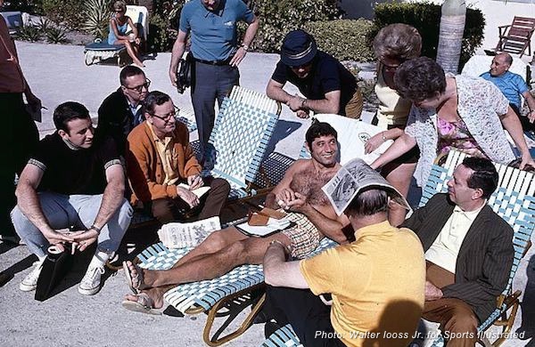 |
|
|
|
Post by HawkeyeJet on Jul 21, 2015 14:09:55 GMT -5
Posting this for 2 reasons. First and foremost, this SI cover is fucking awesome. 2 , the logo on the helmet in the Revis picture is White, not green. Is this just for the picture or a permanent change? Love the cover. Did you happen to notice this one also: That is awesome |
|